T-Mobile eCommerce
Checkout Redesign
The current checkout flow for T-Mobile’s existing customers was outdated with older components, bloated with extra steps, and created additional friction after user submits an order.
I was the co-lead designer responsible for streamlining how customers enter in a new or stored payment method. I balanced pivoting priorities and technical limitations and created solutions that achieve immediate and future goals.
Our team shortened the checkout flow by half and reduced the content by 75%. Our concepts also tested well with usability participants, achieving an average of 6.9/7.0 task ease rating.
T-Mobile • eCommerce • App
Problem
The checkout flow for existing customers suffered from a 40% abandonment rate.
After reviewing previous usability studies about existing customers purchasing in eCommerce, we learned about the following user preferences and pain points:
In a survey, 54% of participants preferred a single-page checkout, versus 17% of participants preferred a multi-step checkout.
The existing experience did not leverage any data from the user’s account, requiring them to input a new address and payment method every time they purchased.
After customer places order, they must review and agree to terms and conditions for electronic consent and financing their purchased goods.
With the business initiative to drive 100% of purchase transactions to digital, we were given an opportunity to improve our checkout flows and envision a Northstar experience for our current customer base.
Business Goals
Reduce cart and checkout abandonment
Improve pricing transparency across eCommerce
Experience Goals
Reduce page redundancy and cognitive overload of content
Streamline flow and align with common eCommerce benchmarks
Discovery
We assessed 24 different benchmarks across eCommerce and identified three opportunities that were achievable improvements for the app overhaul.
Redesign Apple Pay placement and interaction so that customers can quickly check out with a trusted experience
Consolidate “Delivery & Payment” and “Review Order” into a single screen
Reorder checkout steps to accomplish difficult tasks earlier and add predictability to our flows.
My design partner and I focused on a Northstar vision on how customers pay in our checkout flow. We designed for two happy path scenarios – a customer who pays with a stored payment method from their account Wallet, and a customer who adds a new payment method.
First iteration
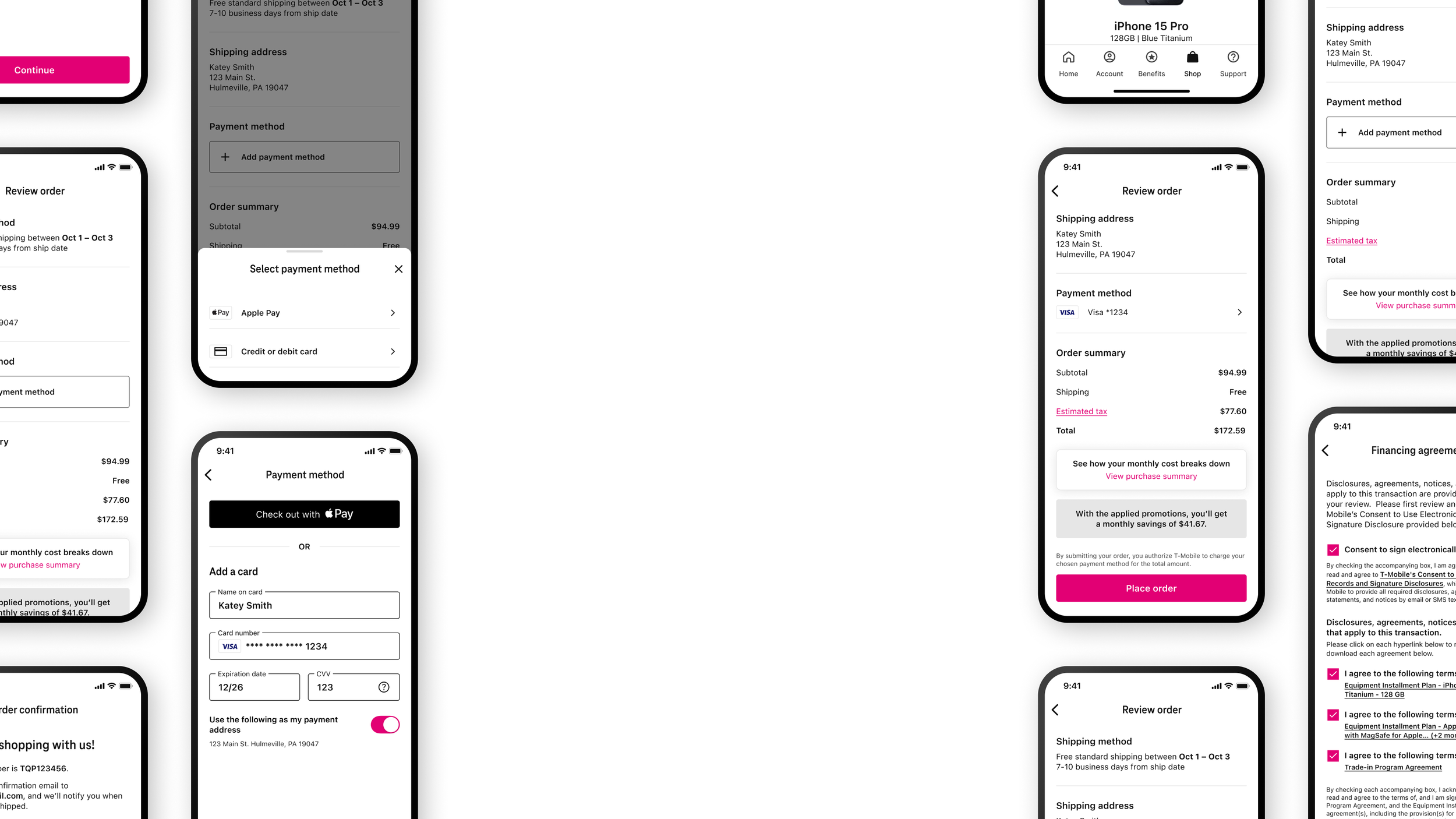
For customers with a payment method saved to their T-Mobile Wallet, their checkout experience is streamlined to two steps:
Agree to Terms & Conditions
Review & Place Order
For customers with no payment method saved, they see a dedicated step to add a new payment method or check out with Apple Pay.
This design would scale for third-party payment methods that the business might introduce in the future.
As we finalized our Northstar vision for checkout, our design team shifted internal organizations and focused on a new directive. Instead of driving towards a complete app makeover and delivering a Northstar vision, our priority was to bring value immediately to customers using the existing app. This meant achieving speed-to-market solutions with a timeframe to launch in 100 days.
To deliver the feature for users to access their saved payment methods, this meant reusing the existing Wallet component from the Payments team that allows customers to pay their bills. I collaborated with designers and product managers from Payments to integrate their components into our checkout flows, while pushing on technical limitations to ensure our solution did not deviate from benchmark findings.
Reusing the Wallet component on the Review Order checkout step requires the user to locate and tap to add a new payment method. I iterated on this component with a dynamic sheet that triggers if no eligible payment method is present in the user’s Wallet, allowing the customer to add a new card or use Apple Pay.
We conducted an unmoderated usability study to test if there were any usability issues with the two concepts – one concept from our Northstar vision, the other was a more feasible speed-to-market solution.
Unmoderated usability • 2 concepts • 12 participants
Both concepts achieved 100% task completion and were found easy to use with no strong preference for either design. Average task ease is 6.8 for Concept A and 7.0 for Concept B (out of 7).
Before & After
Streamlined checkout with a content reduction of 75% on Review Order
Content is streamlined so customers can hyperfocus on their checkout steps. A summary of their purchase is contained as secondary information before placing order.
Shipping information moved from Checkout to Cart to improve pricing transparency
The high cost of taxes on device hardgoods are calculated before user enters checkout, building trust and transparency with customers
Next steps
Gather data for future scalable solutions
Measure customer usage of payment methods allowed between Apple Pay, stored credit card, or adding a new card. Continue to learn behavior and consider future enhancements for payment flexibility, such as multi-tender and alternative payment methods.
Increase collaboration with Payments team
A customer’s Wallet experience at T-Mobile should be consistent, no matter if they’re paying their bill or purchasing a device upgrade. This experience unlocks a core feature to pull a customer’s payment information, and bridges the gap between the Payments and eCommerce teams for future collaboration and holistic design decision-making.