
Downtown Seattle Parking Website Redesign
DSA's website helps visitors park and travel around the area, but the mobile device experience was full of usability issues.
I was part of a redesign project where I managed a design system of 80+ components and 4 page templates.
Our team improved system usability by 70 points and evolved how visitors engage with downtown Seattle.
Downtown Seattle Association (DSA) • Mobile website • 10 weeks

Clickable Prototype
Problem
75% of users moved to mobile, but the website never modernized
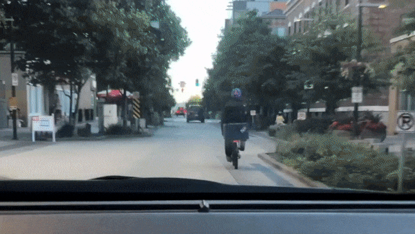
Nonstop road improvements have made downtown Seattle frustrating for parking and foot traffic. Local businesses felt the effects as customers and visitors avoided downtown and spent their money in other neighborhoods.
In 2014, DSA launched a website to help drivers locate parking, and to guide walkers to use a free shuttle service to bypass construction. Their goal is to create a more vibrant and accessible downtown.
Five years later, as 75% of their users went mobile, their solution stayed the same.
The original site graded at 17.5, using the System Usability Score (SUS) method. In comparison, the average score is 68.
This project gave me the chance to shine as a team player. I created a design system to help the team maintain design consistency and iterate at a faster pace.
Sketch linked library • Abstract version control
DSA put a heavy investment on their brand, with signage located on street corners and garages. I leveraged the client's brand guidelines, colors, fonts, and illustrations as the foundation of our design system.
Our basic building blocks led to creating more complex components. The top header and content cards went through several iterations as we continued to test our prototypes. As we reviewed new components and revised older ones, we were able to see the updates instantly across our designs.

As we progressed, we standardized templates that all flows would follow. This led to a consistent browsing experience where users know what to expect on each tap, reducing confusion.
Our design decisions and iterations were grounded on three design tenets. We conducted affinity diagramming sessions to summarize our user research, which includes usability testing and survey data.
Usability testing • 2 task scenarios • 8 participants
Online survey • 20 questions • 45 respondents
We focused on testing the website on mobile due to the emerging user base using phone and tablet devices, and following the approach of mobile-first responsive design. We also received client data on site visitors by region and shuttle ridership, which confirmed that the shuttle service was a critical part of DSA’s mission.
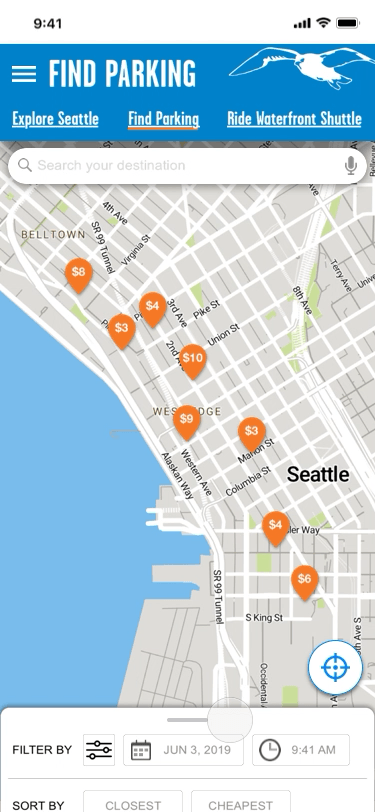
Original Website

Consolidated affinity diagram, clustered into three design princples
Design Tenets
Visual
Participants struggled to complete tasks due to the site's color associations and unclear elements. Visual changes help make the site feel modern and straightforward.
Functionality
Users felt overwhelmed when displayed with lists of garages. Adding sort and filter features make decision-making more simple.
Content
Terminology and CTAs lacked clarity and needed to be revised. We also enhanced the content by adding nearby hot spots such as restaurants and attractions.
Elements of the design system were tested through rounds of prototyping. From ideating concepts to digitizing the first prototype, we were on our way to improve usability.

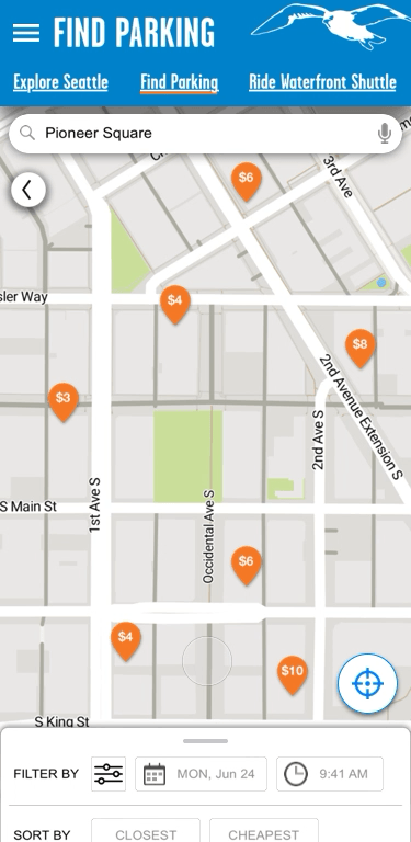
Original website

Prototype V1
Landing Page
Changes
Reduced clutter by removing low priority links
Introduced map of parking garage location pins
Added persistent tab-based navigation that doubled as a page header
Usabiity Findings
Users expected feedback from map interaction
Two-colored pins showed little value
Header navigation lacked discoverability

Original website

Prototype V1
Parking garage list
Changes
Redesigned to a card-based interface, including a photo of the garage and rate per hour
Included icons of garage amenities
Added distance from garage to destination
Usabiity Findings
Icons were too ambiguous
Users expected addresses on each garage card
Final Designs
Revamped landing pages improve context
Users can interact with the map and get results immediately. Redesigned top header lead users to access the site’s critical services. Icons are consolidated and remade to be more intuitive and recognizable.
New functionality increases user control
Users can sort their search results by what’s cheapest or closest to their destination. Inputting time and date information return accurate garage pricing data. Narrow your results down even further with Amenities.

Content cards and details page provide relevant information
Photos of garages help users visually identify how convenient it is to enter or exit the garage. An option to favorite parking garages increases user retention.
Our final SUS score was 87.5, a 70-point improvement from the current website.
“This is one of the more well-reasoned and well-presented Capstone case studies we’ve seen here at SVC... the end result was very solid.”
Takeaways
Onboarding a new team workflow
My biggest undertaking was creating a design system and integrating with the current tools our team was currently using. The learning curve proved to be quite overwhelming, especially when incorporating team members to follow a new workflow. Understanding more about feasibility of resources before making a decision like this would have made this part of the project go more smoothly.
Contextual user testing
A missed opportunity was testing prototypes with users in real-life situations. 60% of survey participants said they discover parking around their destination, with 37% of those using an app or website to locate parking. While I don’t condone user testing while driving, we could’ve gathered valuable data if parked on the side of the street or a similar situation.
Credits
Team
Amy Resling, Project Manager
Kiki Cooley-Lund, Designer
Kiana Sonnenfeld, Designer
Tools
Sketch
Principle
InVision
Abstract
Miro